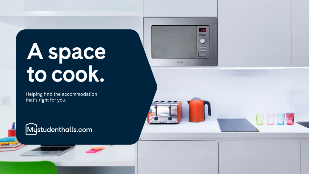
Student accommodation search engine, Mystudenthalls.com has partnered with Studio Koto to launch a rebrand which challenges hackneyed ideas of student living to offer the modern student an intuitive brand with ‘both style and substance’; bringing joy to an overwhelming process of students finding accommodation in a market with unprecedented demand.
The brand, which has successfully been helping students find accommodation since 2011, now works with over 90% of purpose-built student accommodation providers across the UK, and worked with Studio Koto to approach the re-brand with rigorous insight directly from students.

The rebrand launches amidst an unprecedented student accommodation crisis across the UK, with demand outstripping supply and a 118% increase seen in enquiries on the site compared to the previous year since its rebuild in September; Mystudenthalls.com has launched the new brand to establish a stronger connection with their student audience, by working with Koto to look beyond practical needs of student users and establish a cheerful and inspiring brand personality to support them through the stressful process of finding a place to live. It aims to be compassionate with students, not condescending – straight-talking, but not blunt. A helping hand where it’s needed most.
Studio Koto spoke to real students to understand the nuance of issues they were facing when finding the right accommodation to cut through a busy market under pressure. One thing that became clear was how important it was to sell the lifestyle students wanted rather than just the properties. When searching for accommodation, students are always consciously looking for the same things – price, location and people. But they are also searching for a particular university lifestyle. Mystudenthalls.com saw a gap here, and wanted the experience of searching for accommodation to spark excitement in students and get them thinking about their whole university experience, rather than just what a room will look like in the flesh. This led to a series of new creative elements that would help connect with students in this way. These included:
- New logo, designed to convey a sense of confidence, security and personality
- Developing a more authentic photography style that students can connect with
- Adopting a tone of voice that talks about brand benefits in a more unique and emotive way and builds a connection with students
- Creating memorability through colour and typography, to add vibrancy, optimism and character to brand communications
- Developing a flexible graphic system that can scale the brand’s volume and vibrancy across web and social.
“Koto worked with the MSH team to bring their brand to life. We worked to avoid the cliches of student living and instead create something which had a strong mix of style and substance. The result is a confident brand which we hope plays a part in taking their business to the next level” James Greenfield – CEO, Koto
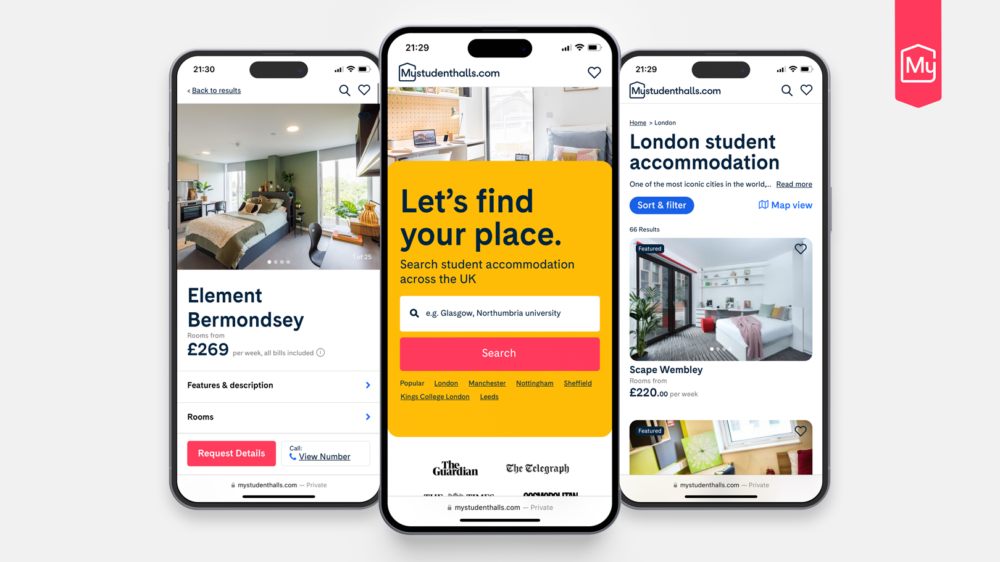
In addition to the rebrand, the search engine has also undergone a mammoth full platform redesign based on extensive user testing which offered fresh insight into the frustrations students are facing when finding the right accommodation online in a strained market.
It understands that searching for university accommodation is a highly personal and instinctual process, so working alongside its long term design and development partner Castus, Mystudenthalls.com has implemented a host of new features to create a faster and more bespoke experience depending on student needs, which range vastly. The simple, intuitive features allow users more control over their property search – from new sort options and map searches to advanced filtering tools. Users are able to search by key property features – such as gyms, room type preference, security options and distance from universities, as well as price and properties with special offers. Most importantly, the new platform places information that matters the most at the very front and centre of the experience.
“The new Mystudenthalls.com was designed for users. Those users were a big part of the design process. We talked to them and observed them whilst they searched for student accommodation online. Through this user-centred approach, we tried to build a website that gets out of their way, and focuses exclusively on their needs.” Matthew Harpin – Creative Director, Castus.
To find out more about Mystudenthalls.com, visit the website here.


